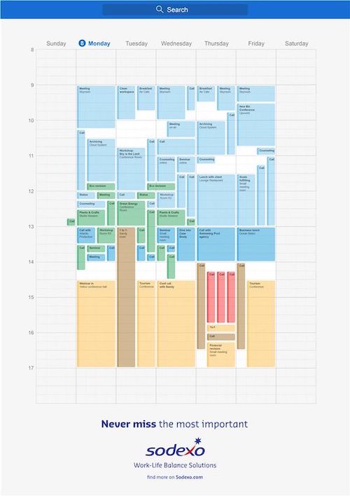
THE ORIGINAL? Sodexo – 2022 Never miss the most important. Click the image to enlarge
Golden Drum Shortlist
Ag : Leo Burnett (Czech Rep)
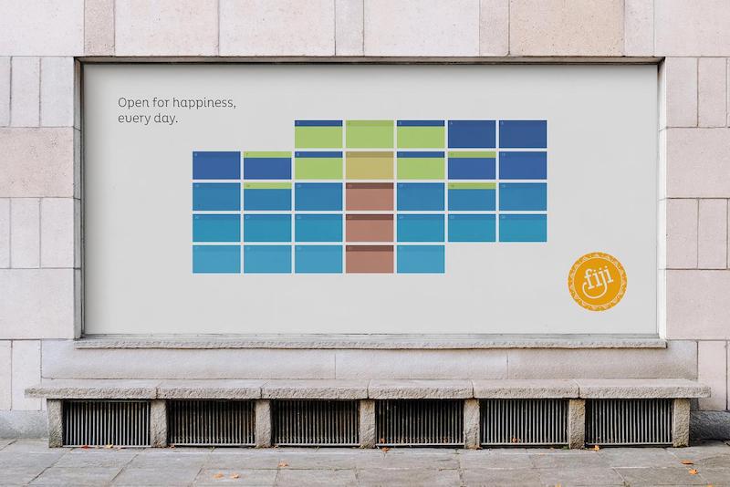
LESS ORIGINAL Fiji Tourism Board – 2023 Open for happiness every day. Click the image to enlarge
Source : OOH Mag
Agency : The Hallway (Australia)
Eng
“The creative idea: a google calendar-style timetable with filled boxes reminiscent of a holiday image. Originality level is back to square one. The Australian creative team is in desperate need for vacations! Copy or coincidence? Your turn to judge!”
Fr
« L'idée créative : un emploi du temps style google calendar dont les cases remplies font penser à une image de vacances. Niveau originalité c'est retour à la case départ. Pas de vacances pour la pompe ou hasard de calendrier? À vous de juger! »
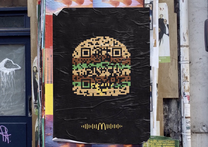
THE ORIGINAL? Mc Donald’s / Flashcode teaser – 2020 A simple scan of the poster links to a playlist
with unexpected musical genres.
Agency : TBWA Paris (France)
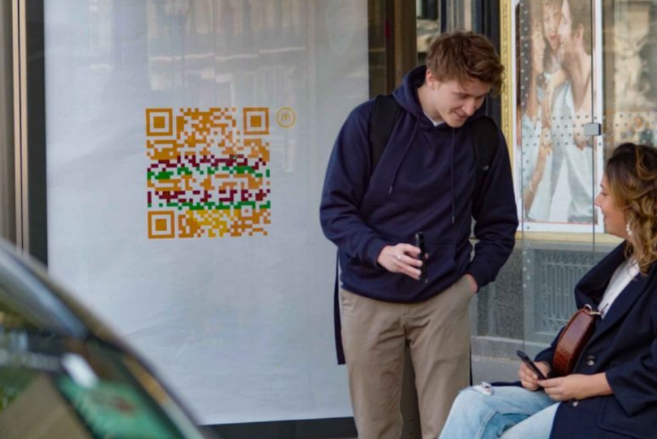
LESS ORIGINAL Mc Donald’s / ReQRuitment – 2022 A simple scan links to job offers at Mc Donald’s Source : Cannes Lions BRONZE, Prix GPCE 2023
Agency : Starcom / Publicis Conseil (France)
Eng
“The creative idea : A minimalistic, iconic flashcode shaped big mac without any words. When you scan it you can access some interactive Mc Do content on your mobile... How many time are we gonna see this idea coming back in the streets of Paris before we'll get bored to death?”
Fr
« L'idée créative : Un big mac iconique et minimaliste en forme de flashcode sans aucun mot. En le scannant, vous accédez à du contenu Mc Do interactif sur votre mobile... Combien de fois va-t-on voir cette idée revenir dans les rues de Paris avant l'indigestion totale? Ce concept réchauffé a quand même décroché un Lion à Cannes en 2022 et un prix au Grand-Prix de la Com Extérieure 2023! Stop ou encore? »
THE ORIGINAL?
Bob’s Burger « quickly delivered » – 2007
Source : Cannes Archive
Click the image to enlarge
Agency : NBS Rio de Janeiro (Brazil)
LESS ORIGINAL
Doordash McDelivery « Faster food » – 2023
Source : It’s Nice That,Cannes Lions SHORTLIST
Click the image to enlarge
Agency : No Fixed Address (Canada)
Eng
“The very same creative idea : images show burgers as if they’re moving at high speeds on route to being delivered. These posters evoke movement and a feeling of rushing by. A quick copycat? Not so quick apparently, since they still took 16 years to redo it!”
Fr
« Une idée incroyablement identique qui a visiblement laissée des traces ... dans la mémoires des créatifs. Une coïncidence ou une petite copie à la va vite? Pas si vite fait que ça quand même puisqu'ils ont mis 16 ans à la refaire! »
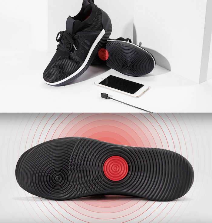
THE ORIGINAL? DropLabs EP01 Vibrating Sneakers – 2019 Syncing music to shoes that vibrate Source : TechCrunch,The Verge
Agency : DropLabs (Israël)
LESS ORIGINAL Anghami – Sole Music – 2023 Syncing music to soles that vibrate Source : Dubaï Lynx, BestAdsOnTV
Agency : And Us (United Arab Emirates)
Eng
“The creative idea : connected via Bluetooth to a mobile music playlist, the shoe (or sole) vibrate allowing the hearing impaired to feel the rhythm of the music wherever they are. Submitting a not so innovative innovation to award show is quite a bold move. Blatant copy or vibrant homage? Be the judge!”
Fr
« L'idée créative : connectée via Bluetooth à une playlist de musique mobile, la chaussure (ou semelle) vibre permettant aux malentendants de ressentir le rythme de la musique quel que soit l'endroit où ils se trouvent. Envoyer à des awards une innovation qui n'en est pas une il fallait oser! Grosse pompe flagrante ou vibrant hommage ? À vous de juger! »
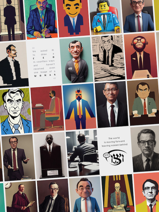
THE ORIGINAL? Wizo – 2022 What happens when artificial intelligence is asked to draw a CEO (a doctor, a president) Source : Luerzer’s Archive, Best Ads On TV
Agency : Blanco Tel Aviv (Israël)
LESS ORIGINAL Jamais Sans Elles / Women’s Day – 2023 What happens when artificial intelligence
is asked to draw a CEO (a surgeon, a fireman)
Click the image to enlarge
Agency : Havas Paris (France)
Eng
“The creative idea: ask an artificial intelligence (Midjourney or DallE) to represent a CEO, a doctor... and see the result: only men! A women's day topic in tune with the times that gives rise twice to the very same creative expression. Coincidence or copy (you can directly incriminate the AI)? Your turn to judge!”
Fr
« L'idée créative : demander à une intelligence artificielle (type Midjourney ou DallE) de représenter un patron, un médecin... et constater le résultat : que des hommes tant le stéréotype masculin est accolé à ces métiers. Un sujet dans l'air du temps qui donne lieu à la même expression créative. Coïncidence ou copie (réalisée automatiquement par une IA?)? À vous de juger! »


Eng “The creative idea: a google calendar-style timetable with filled boxes reminiscent of a holiday image. Originality level is back to square one. The Australian creative team is in desperate need for vacations! Copy or coincidence? Your turn to judge!”
Fr « L'idée créative : un emploi du temps style google calendar dont les cases remplies font penser à une image de vacances. Niveau originalité c'est retour à la case départ. Pas de vacances pour la pompe ou hasard de calendrier? À vous de juger! »