Giant replicas / Une belle paire de pompes?
 |
 |
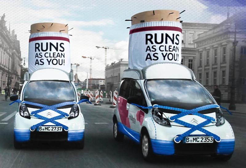
| THE ORIGINAL? Citroën CarSharing Multicity – 2013 Click the image to enlarge Source : You Tube (case study), Behance Agency : Havas Düsseldorf (Germany) |
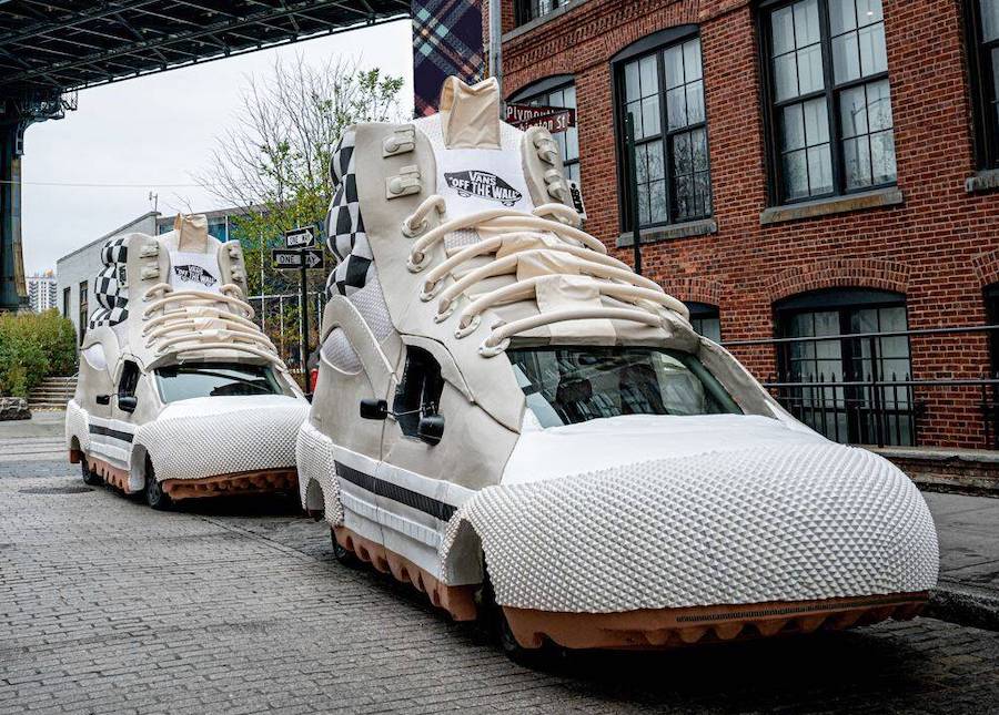
LESS ORIGINAL Vans sneakers « NYC Takeover » – 2022 Click the image to enlarge Source : AdAge Agency : GUT Los Angeles (USA) |
Be the judge!
7389


Eng “The idea : Create two running shoes, designed to look like giant replicas of sneakers and drive them throughout the city to drag people's attention. Looks like the American followed the footsteps of the Germans on this case. Gigantic copycat or coincidence? Be the judge !”
Fr « L'idée : créer deux chaussures, conçues pour ressembler à des répliques géantes de baskets et les conduire à travers la ville pour attirer l'attention des gens. Les américains ont-ils commis une grosse pompe ou ont-ils marché dans les pas des allemands sans s'en rendre compte? À vous de juger! »