an octopus or a plastic bag? / La nature mise à sac
 |
 |
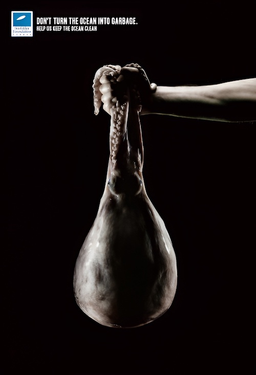
| THE ORIGINAL? Surfrider Foundation – 2006 « Don’t turn the ocean into garbage ». Click the image to enlarge Agency : Young & Rubicam (France) |
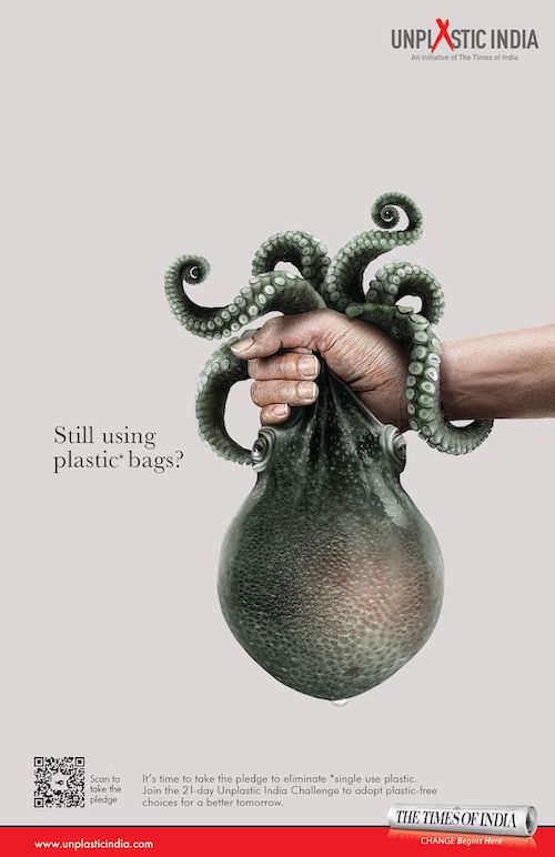
LESS ORIGINAL The Times of India – 2023 « Still using plastic bags? ». Click the image to enlarge Agency : Wunderman Thompson (India) |
Be the judge!
8112


Eng “The creative idea: an octopus that looks like a plastic bag to raise awareness about ocean pollution. A little copy / paste, and presto the deal is in the bag! I still prefer the first execution. There was no need for a bad copy. Coincidence? Be the judge!”
Fr « L'idée créative : une pieuvre qui ressemble à un sac plastique pour dénoncer la pollution des océans. Un petit copier coller, et hop l'affaire est dans le sac! Je préfère néanmoins l'œuvre originale. Pourquoi refaire en moins bien? Coïncidence? À vous de juger! »