Business graphs with flags / Une copie? On stats…
 |
 |
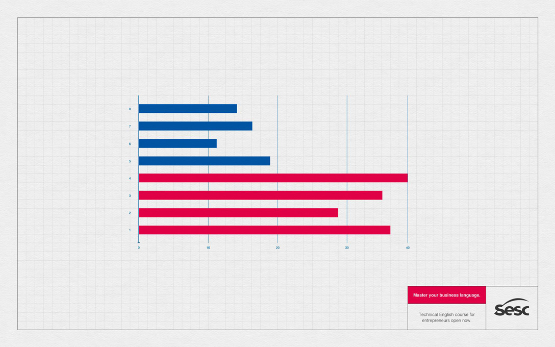
| THE ORIGINAL? Sesc English Course – 2017 “Master your business language” Click on the image to enlarge Source : Adeevee Agency : Competence, Florianópolis (Brazil) |
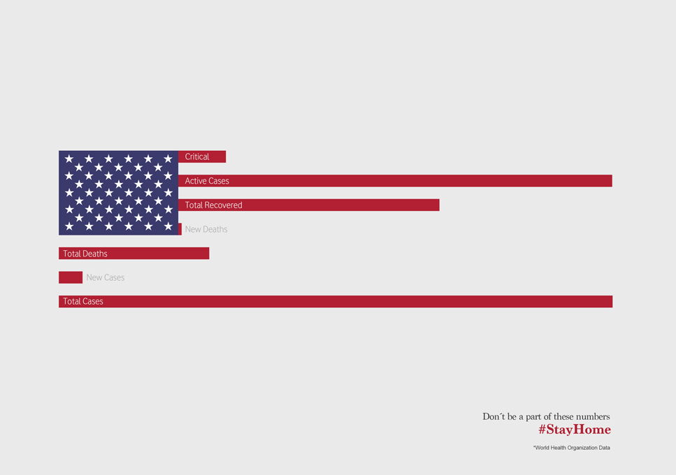
LESS ORIGINAL Covid-19 #StayHome – 2020 “Numbers are sending us a very direct message” Click on the image to enlarge Source : Adsoftheworld Agency : Wunderman Thompson (Portugal) |
Be the judge!
11395


Eng “The creative idea: use the most famous flags and divert them to present statistics in a professional graphic manner according to the principle of data visualization. Looks like the lockdown was not a creative period for everybody.”
Fr « L'idée créative : utiliser les drapeaux les plus connus et les détourner pour présenter des statistiques façon graphiques professionels selon le principe de la visualisation de données. Encore des créatifs qui, pendant la crise du Covid-19 sont restés confinés dans de vieux schémas de pensée. »