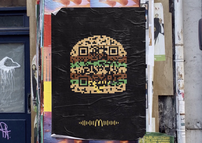
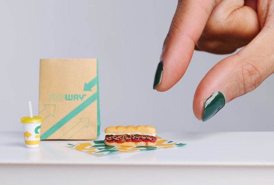
Flashcode Big-Mac without any words / L’In-QR-oyable lookalike
 |
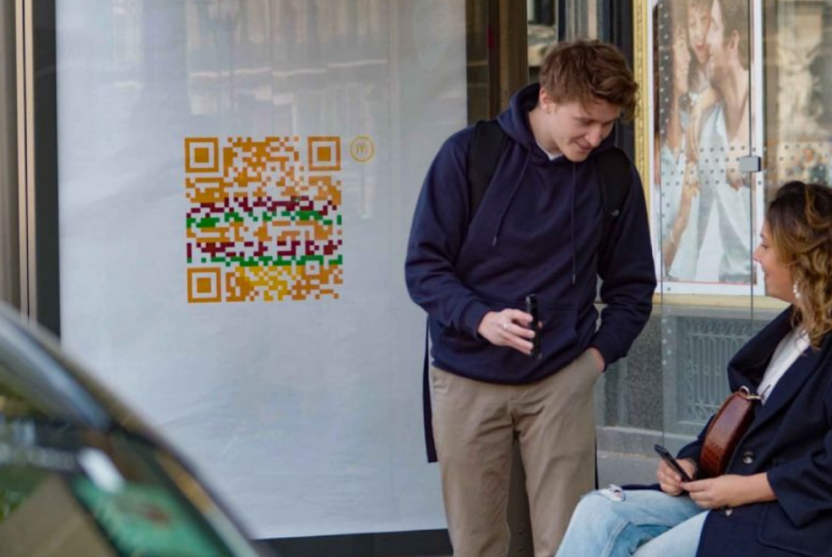 |
| THE ORIGINAL? Mc Donald’s / Flashcode teaser – 2020 A simple scan of the poster links to a playlist with unexpected musical genres. Agency : TBWA Paris (France) |
LESS ORIGINAL Mc Donald’s / ReQRuitment – 2022 A simple scan links to job offers at Mc Donald’s Source : Cannes Lions BRONZE, Prix GPCE 2023 Agency : Starcom / Publicis Conseil (France) |
Be the judge!
36110


Eng “The creative idea : A minimalistic, iconic flashcode shaped big mac without any words. When you scan it you can access some interactive Mc Do content on your mobile... How many time are we gonna see this idea coming back in the streets of Paris before we'll get bored to death?”
Fr « L'idée créative : Un big mac iconique et minimaliste en forme de flashcode sans aucun mot. En le scannant, vous accédez à du contenu Mc Do interactif sur votre mobile... Combien de fois va-t-on voir cette idée revenir dans les rues de Paris avant l'indigestion totale? Ce concept réchauffé a quand même décroché un Lion à Cannes en 2022 et un prix au Grand-Prix de la Com Extérieure 2023! Stop ou encore? »