Hijacked logotype & breast cancer / Deux idées à touche touche?
 |
 |
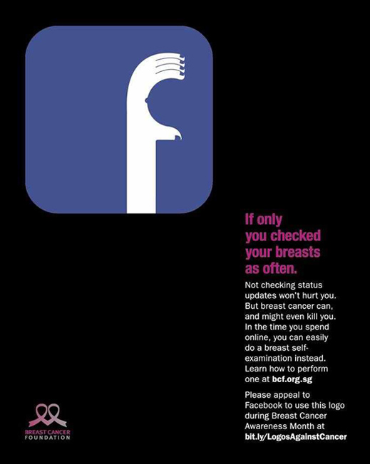
| THE ORIGINAL? Breast Cancer foundation – 2014 « If only you checked your breasts as often » Agency : DDB (Singapore) |
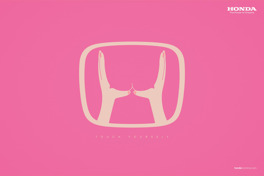
LESS ORIGINAL Honda – Breast Cancer Awareness – 2019 « Touch Yourself » Source : Adsoftheworld Agency : Made in Space (Spain) |
Eng “The resemblance between the two graphic concepts is more than palpable! The first letter of the acronym of a company is diverted to represent hands performing a self-diagnosis.”
Fr « La ressemblance entre les deux concepts graphiques est plus que palpable! La première lettre du sigle d'une entreprise est détournée pour représenter des mains qui exécutent un auto-diagnostique. Le rapport entre Honda et le cancer du sein? Une histoire d'airbags sans doute... »
Be the judge!
135146
jim diorio
03.13.2019 - 15:54
I usually agree with you, but these are entirely different ideas conceptually: the FB one is much better, as it has an idea, which is about checking something important more often than FB… whereas the other one is a typical « how do we connect our brand that has nothing to do with this cause to this cause. »
Joe La Pompe
03.13.2019 - 16:03
I think the result is really close on a visual point of view. Same trick with an hijacked and redesigned logotype… but you’re totally right, the bottom idea is much better, clever and to the point in the original one!
Joe La Pompe
10.22.2021 - 12:36
Same spanish agency, now for Hyundai
https://www.adsoftheworld.com/media/print/hyundai_details_can_be_important