sign pen and negative space / La même écriture graphique?
 |
 |
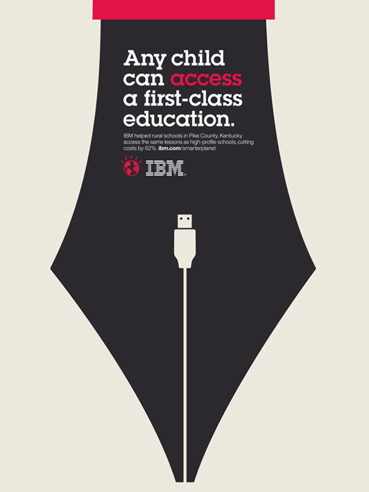
| THE ORIGINAL? IBM Smarter Planet Solutions – 2010 « Any child can access a 1st class education » Source : EPICA GOLD, CLIOS SILVER Agency : Ogilvy Paris (France) |
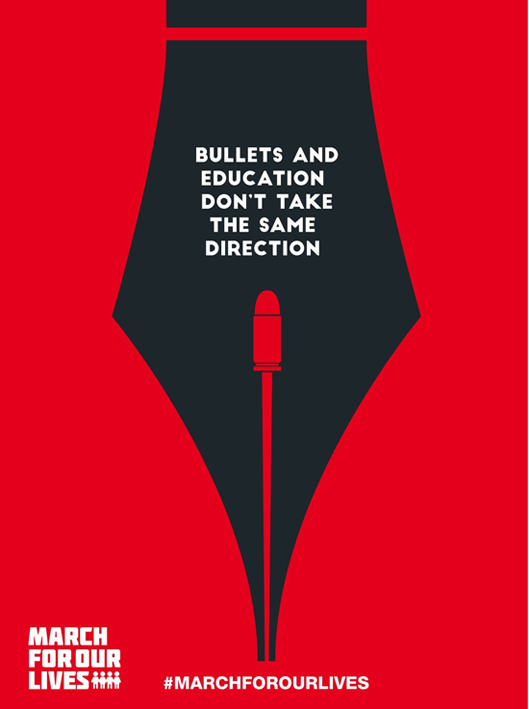
LESS ORIGINAL March For Our Lives – 2018 Part of the « Ad Age challenge » Source : Arabad, Coloribus Agency : Adpro Communications (Jordan) |
Eng “The messages are totally different but the visual idea and executions are way too similar to me. The use of the pen symbol, the framing, the layout, the negative space and the illustration are almost identical. Hard to believe it's a pure coincidence don't you think?”
Fr « Le sujet est certes très différent et on peut dire ce que l'on veux, mais la ressemblance crève les yeux : le stylo, l'illustration, le cadrage, l'usage de l'espace négatif... C'est si frappant que ma plume, acerbe ou non, ne changera rien à la dérangeante sensation de déjà-vu. »
Be the judge!
105275
Totocaca
04.30.2018 - 16:39
Toujours d’accord avec toi,
Mais sur ce coup, le propos est exactement opposé, si la forme peut être proche, le fond est très différent.
Rand
07.02.2018 - 12:04
The main element used (the nib of the pen) is a common element that anyone can find and use… If you check out Shutterstock, you’ll find over 22,000 options of pen nibs to choose from. This does not lessen from the originality of the work. It only demonstrates skills and talent in connecting the concept and the design, and ultimately making impact
samloco
07.02.2018 - 16:00
I totally agree with Totocaca and Rand.
Skov
03.19.2019 - 17:57
..or https://www.wallpaper.com/art/homework-polish-poster-design